
Making it real: the ICE Raid Prep & Response flyer was built to help small business owners share clear, simple steps with their employees.
At Tembo NYC, I’ve always believed that good design isn’t just about how something looks — it’s about how it works in the real world. Recently, I had a chance to see that play out in a very tangible way.
Out in the Field
Not long ago, I joined Indivisible volunteers in Inwood to talk with small business owners about how to prepare for possible ICE raids. We carried with us the Employer’s Toolkit — a bifold handout filled with important information. On paper, it checked all the boxes: how to set up a private space, choose a point person, understand warrants, and protect workers’ rights.
But in practice? It was tough. The toolkit was text-heavy, a little overwhelming, and the sample warrants came on a separate sheet of paper. Trying to juggle all that while having a sensitive conversation with a busy shop owner wasn’t exactly smooth. More often than not, the handout ended up folded away instead of posted where employees could actually use it.
That experience stuck with me. As a designer who believes that good design solves problems, I knew there had to be a better way.
Designing a Real Solution
Back at my desk, I rethought the problem through a design lens. Even the name “Employer’s Toolkit” felt unclear. It didn’t communicate urgency or purpose. So I rebranded it as the ICE Raid Prep & Response Flyer — a single-page, practical guide built to work in the field, not just on a desk.
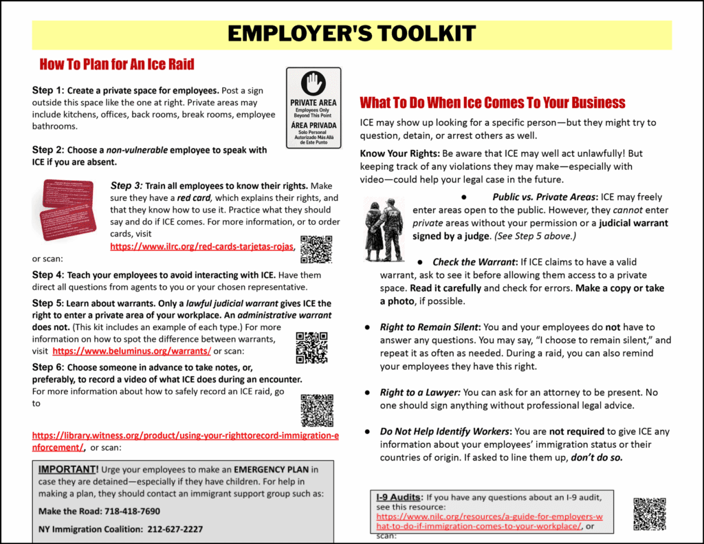
ORIGINAL EMPLOYER’S TOOLKIT
packed with info, but overwhelming in practice.
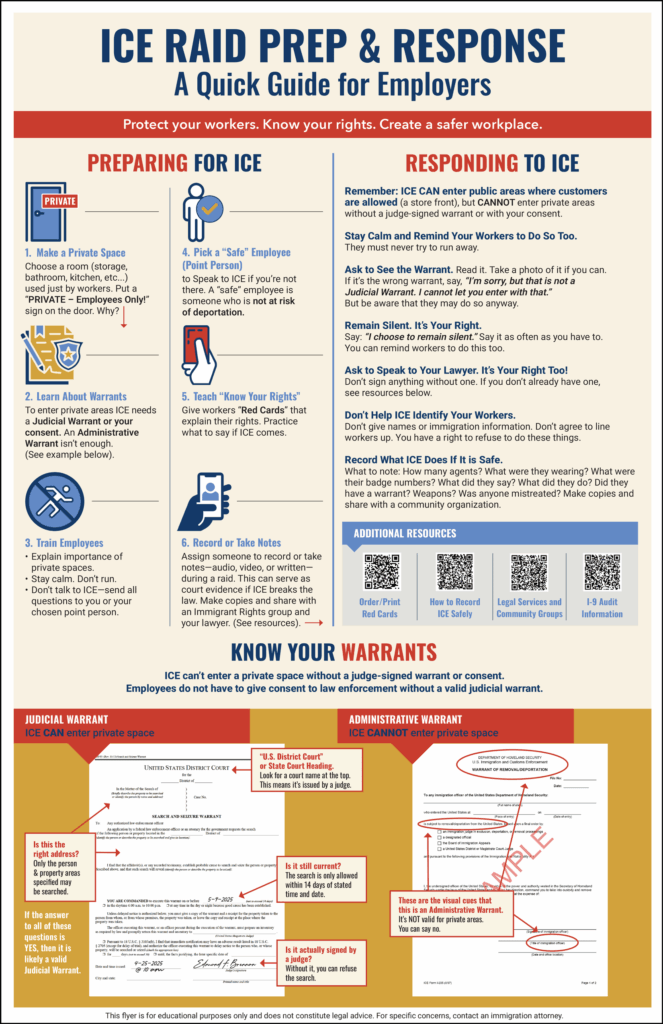
REDESIGNED ICE RAID PREP & RESPONSE FLYER
clear, simple, and built for small businesses to post where employees can see it.
HERE’S WHAT CHANGED:
One-glance clarity – Numbered steps in plain language, so volunteers can walk through it with business owners in minutes.
Everything in one place – Side-by-side examples of judicial vs. administrative warrants, with no extra sheets or fumbling.
Built for the wall – Formatted to be pinned up in a kitchen or back office, giving employees daily visibility.
Empowering tone – Calm, direct language that focuses on rights and safety, not fear.
Seeing the Difference
I went back out this past weekend with the new flyer, and the difference was immediate. Business owners followed along step by step. Many said right away, “I’ll hang this up for my employees.” Instead of tucking it away, they treated it like a practical tool worth sharing.
That’s when it hit me — success! Design thinking had turned a difficult conversation into one that was easier, clearer, and more actionable.
Why This Matters
Good design doesn’t just communicate — it empowers. The new flyer gave volunteers confidence to explain each step, while giving small business owners a tool they could use to protect their workers.
“Simplicity done right is the hardest and most valuable design skill.”
It transformed an overwhelming resource into something usable and shareable. It moved critical information off the page and onto the walls of businesses — right where it’s needed most.
At Tembo NYC, that’s what drives me — using creativity not just to tell stories, but to spark change in real communities. Design has the power to move ideas off the page and into people’s lives. If you’re working on something that needs to spark action, let’s create it together.